Repping Hadley at DataFest

This weekend, we had our fourth annual DataFest event at UCLA. DataFest is a weekend-long data hackathon, where we give students an interesting dataset, plenty of snacks, and a space to work, and they try to come up with insights. This was the third year I attended, and it seems to just get bigger and better every time. We had about 140 undergraduates from all around Southern California this year. Groups came from UCLA, USC, Cal Poly SLO, UC Riverside, and Pomona College. Our data sponsor was GridPoint, an energy-management company. They provide a service that is similar to the Nest (my simplistic interpretation), and they gave us tons of data for the students to analyze. I signed an NDA, so I shouldn’t be very specific about the contents of their proprietary dataset, but students were able to find tons of cool insights.
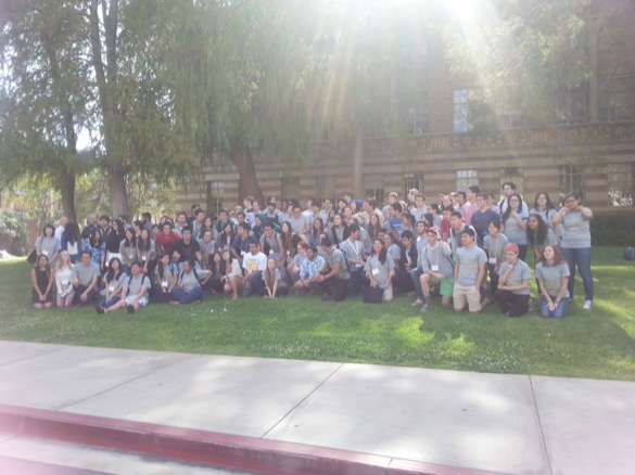
1DataFest 2014 students Our 2014 DataFest contestants
My personal favorite project (and Best Visualization prize winner) was a group who found and analyzed a trend in misusing AC, which they defined as running the air conditioner when outside temperatures were below some cutoff, I believe 60 degrees. Really, all the projects were fantastic.
As a graduate student “consultant” at DataFest, my responsibility was to float around and help the contestants. Since most of the UCLA participants have had me as a TA in a class where we’re using R, I got a lot of programming questions. Invariably, when students were really stuck on something it was a hard problem (which was bad for me looking like a superhero, but means that our students are getting the hang of R!).
During the weekend, I realized that I was repping Hadley Wickham’s packages even harder than usual. For example, students kept coming to me with incredibly hairy code, filled with multiple for loops using explicit indices and making matches over many factor levels, asking for help debugging why it wasn’t doing what they wanted. Although I would attempt to talk through their code with them, it was usually beyond me getting up to speed quickly enough to catch what was probably a small typo somewhere. Instead, I constantly suggested plyr, and actually became pretty good at it over the weekend. ddply() is such a heavy-hitter! There were definitely a few “whoa”s from students who hadn’t seen the power of plyr before. Most of my students already know ggplot2, but they haven’t gone beyond the basic geoms. I helped another group use geom_polygon() to show an additional layer of data in their plot. Finally, the data was all time stamped, and although the base R functions like as.POSIX() would work, I saw a lot of code trying to make character matches to pull months or years from the data. lubridate to the rescue!
In fact, I must have a standard line on Hadley, because at one point a group of students called me over to join a conversation with some of our sponsors from Summit Consulting. “Amelia, what do you think about Hadley Wickham?” they asked. “He’s great!” I said. “He writes all the best packages!” This got a big laugh, to the point that I think they’d made a bet on what I’d say.
RStudio was a generous sponsor of the event, but I think next year they should send some visitors! At the very least, we need to bring back our mini-seminar series during DataFest, and do demos of some of these useful packages.
For more on DataFest, check out our twitter (and the hashtag #datafest), as well as this great article from FiveThirtyEight. The article mentions that there were three other DataFests this year, at Duke, the Five Colleges and Princeton. Next year, we’re hoping to go even more national, with support from the American Statistical Association. I can’t wait to see where it goes in the future!